
How Digital Menu Boards Increase Restaurant Sales (And When They Don't)
Digital menu boards don't sell more food because they're digital. They sell more because of what digital lets you change. Here are the five mechanisms that actually move average order value — and how to measure them.
On this page
Search for whether digital menu boards increase sales and you will find confident percentages: 30% uplift, 5% more traffic, double-digit growth in average order value. Almost none of them cite a method, a sample size or a control. Most trace back to a vendor case study from a decade ago.
That is a shame, because the underlying effect is real — it is just not the effect the numbers claim. Digital menu boards do not sell more food because they are digital. They sell more because of what digital lets you change, and because of what you can change at the moment somebody is deciding. Here are the five mechanisms that actually work, the ones that don't, and how to measure the result in your own restaurant without fooling yourself.
The honest answer up front
A digital menu board displaying exactly the same menu, in the same layout, at the same prices as your printed board will not change your revenue. It cannot. Nothing about the customer's decision has changed.
What changes revenue is content behaviour that print made impossible or too expensive: reordering the board by margin, switching menus by daypart, promoting an attachment at the point where the attachment decision is made, and removing items the kitchen has run out of before the customer reaches the till.
So the honest framing is: the board is an enabler, not a cause. If you install one and change nothing, expect nothing. If you install one and use it, the lift shows up in average order value and attachment rate — rarely in footfall, which is driven by things happening outside your door.
The one number to watch: average order value, segmented by daypart. Not total revenue, which moves with weather, season and everything else. Not footfall, which the board cannot influence. AOV within a daypart is the metric the board can plausibly change, which makes it the only one worth attributing to it.
Mechanism 1: Menu engineering you can actually act on
Menu engineering classifies every item on two axes — popularity and contribution margin — into four groups. Stars sell well and make money. Plowhorses sell well and make little. Puzzles make money but nobody orders them. Dogs do neither.
The prescription has been the same for forty years: give stars the best position, work out why puzzles are being ignored, reprice or reposition plowhorses, and remove dogs. Restaurants have known this for decades. The reason most do not do it is that acting on it means reprinting the board, so the analysis happens once a year at most and the board reflects a menu mix from twelve months ago.
With a digital board the cost of acting drops to a few minutes. That changes menu engineering from an annual project into a monthly habit, and the compounding effect of that habit is where most of the genuine lift comes from.
Practically:
- Prime position is the upper-centre of the board, and the item immediately after a category heading. Eye-tracking work on menus consistently finds these two positions get disproportionate attention. Put a star there, not whatever happens to be alphabetically first.
- Move one puzzle into a promotional zone for two weeks. If it sells, it was a visibility problem. If it does not, it is a dog with a good margin and it should come off.
- Reprice plowhorses in small increments and watch. High-popularity, low-margin items usually have more price tolerance than operators assume, and digital lets you find the ceiling without committing to a print run.
Mechanism 2: Dayparting removes irrelevant choice
A single board carrying breakfast, lunch and dinner is showing every customer roughly twice as many options as are relevant to them. That has two costs.
The first is space: those irrelevant items consumed the room your legible type needed, so everything is smaller and harder to read.
The second is decision cost. Longer menus take longer to decide from, and longer decisions in a queue mean either a slower line at peak — a direct throughput problem — or customers defaulting to whatever they ordered last time, which is the enemy of ever selling them anything new.
Dayparting removes both costs at no operational effort, because the board switches itself. It is the single highest-return thing you can do with a digital menu board, and it does not require any creative work — only a schedule.
Mechanism 3: The queue is captive attention
A customer waiting in line is doing nothing else. That is a genuinely rare situation, and it is where a board's second job lives: not just informing the decision, but expanding it.
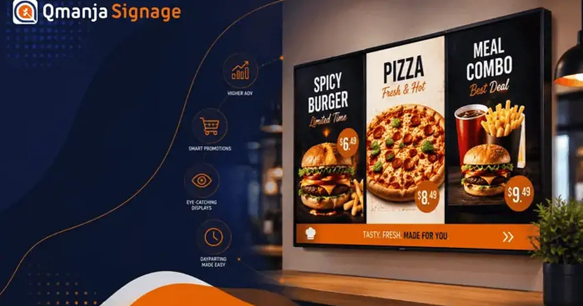
The pattern that works is a promotional zone that runs alongside the menu rather than replacing it. The menu stays still so it can be read; the promo zone rotates through two or three things you actually want to sell. A split-screen layout lets one panel do both, which is also why you often need fewer screens than you think.
What to put in the promo zone, in descending order of reliability:
- The combo that upgrades an order somebody is already about to place. Highest attachment, because it requires no new decision — only a bigger version of one already made.
- A limited-time item with an explicit end date. Scarcity works, but only if it is true; a "this week only" item that is still there in March teaches customers to ignore the whole zone.
- The high-margin add-on. Sides, drinks, desserts. Shown beside the item they attach to, not on a separate screen the customer already walked past.
- Loyalty sign-up. Lower immediate return, but the queue is the only moment the customer has both attention and a phone in hand.
Mechanism 4: Motion at the decision point
Motion attracts attention. That is a fact about human vision, not a marketing claim, and it cuts both ways.
Used well — a short, slow loop of the dish being made, in one zone, silent — it draws the eye to the item you want noticed and does the job a photograph cannot. Used badly, motion is destructive: transitions on the menu itself make it unreadable, and anything flickering in peripheral vision while somebody is trying to read prices actively costs you the sale.
The rules that hold up in practice:
- Motion in one zone only. Two moving zones compete and neither wins.
- Under ten seconds, looping, no hard cuts.
- Silent, always. Audio in a queue is an irritation, and in most premises it is also a licensing question.
- The menu list itself never animates. Not fades, not slides. It is a reference document; leave it still.
Mechanism 5: Price presentation and anchoring
How prices are displayed changes what people order, independent of what the prices are.
Right-aligned price columns invite price-first shopping. The eye runs down the column and picks a number, then works backwards to the food. If your positioning is value, that is fine and you should keep the column. If it is not, put the price immediately after the item name in the same weight as the description, and drop the currency symbol. The scan slows down and the food comes first.
Anchoring works, and digital makes it adjustable. A premium item at the top of a category makes everything below it read as reasonable, whether or not the premium item sells. The digital advantage is that you can test which anchor works rather than committing to one for a year.
Combos should show the saving, not just the price. "$12.50" is a number. "$12.50 — save $2.80" is an argument. This is the single easiest change on this list and it is frequently missed.
One caution: none of these are tricks that survive a bad product. They change which of your items get chosen. They do not make people visit.
What does not work
Worth stating plainly, because these consume budget and produce nothing measurable.
- Digitising the printed menu unchanged. The most common outcome of a menu board project, and it has no effect on anything except the electricity bill.
- Screens with no viewing position. A board mounted where nobody stands still is decoration. Walk the room before mounting.
- A board that changes constantly. Regulars learn where things are. Reshuffling the core menu weekly destroys that and slows everyone down. Keep the structure stable and rotate the promotional zone.
- Entertainment content. News tickers and music videos on a menu board pull attention away from the menu. There is a place for ambient content — a waiting area, a bar — but it is not the board people are ordering from.
- Too many promotions at once. Three offers competing for the same zone means none of them registers. One at a time.
The mechanism nobody counts: throughput
Average order value gets all the attention. In a queue-driven restaurant, order speed is often worth more, and it is the effect operators are least likely to measure.
The logic is simple. At peak, your revenue ceiling is set by how many orders you can take, not by how much each customer might spend. Anything that shortens the time between a customer reaching the till and finishing their order raises that ceiling directly.
A board that is readable from the back of the queue means customers decide while waiting rather than on arrival. A board that shows only the relevant daypart halves the options they have to process. A board that hides sold-out items eliminates the worst kind of delay — the one where the customer has already decided and now has to start again.
That last one is worth dwelling on. Removing a sold-out item is a thirty-second job on a digital board and impossible on a printed one. Every customer who orders an unavailable item costs you the time to explain, the time to re-decide, and a small amount of goodwill. During a rush, on a popular item, that compounds fast.
How to measure it: orders per hour during your busiest sixty minutes, compared like-for-like across weeks. If you have a POS that timestamps order start and completion, average order duration at peak is even better. Either is a cleaner signal than revenue, because it is much less contaminated by weather and season.
Compliance content that also sells
Allergen and nutrition information is a regulatory requirement in many markets, and most restaurants treat it as a legal box to tick — a laminated folder behind the counter or a footnote in six-point type.
On a digital board it can be both compliant and useful. Rotating allergen and calorie information into the layout, or making it a dedicated zone, does three things at once: it satisfies the requirement in a form people can actually read, it removes a category of question from your staff at peak, and it lets customers with dietary restrictions self-serve rather than asking — which, for a meaningful segment, is the difference between ordering and leaving.
The operational advantage is the same one that applies everywhere else here: when a supplier or a recipe changes, the information updates in one place instead of requiring a reprint that, realistically, will be delayed.
How to measure the lift honestly
Most reported uplift numbers are the result of comparing a period after installation with a period before, and attributing the entire difference to the board. That comparison is worthless: it includes seasonality, weather, menu changes, price changes, staffing and whatever else happened that quarter.
Here is a method that produces a number you can actually trust.
Pick a metric the board can plausibly move. Average order value within a daypart, or attachment rate for a specific add-on. Not total revenue. Not footfall.
Establish a baseline over at least four weeks. Two weeks is not enough to average out day-of-week effects and one unusual week.
Change one variable. Move one item into the promo zone. Change the combo presentation. Add a daypart switch. One. If you change three things you will learn nothing about any of them.
Compare like periods. The same days of the week, ideally the same weeks of consecutive months, and exclude holidays and anything unusual.
Use proof-of-play to confirm what actually ran. This step gets skipped and it invalidates everything. If the promo zone was blank for four days because a player dropped off the network, your comparison is measuring nothing. Proof-of-play logs turn "what we scheduled" into "what actually played", which is the prerequisite for trusting any result.
Running a clean A/B test across locations
If you have several similar sites, you can do considerably better than before-and-after.
Split matched locations into two groups — matched on volume, format and customer mix, not just on being nearby. Run the change in group A, leave group B unchanged, and compare the change in each group over the same period. Seasonality, weather and any national marketing hit both groups equally, so the difference between the two differences is attributable to the change.
This is more work, and it is the only way to get a number worth quoting to anyone. With screen groups, running two content variants across two sets of locations is a scheduling exercise rather than a project.
A 30-day playbook
If you already have digital boards and want to find out what they are worth, this is a reasonable first month.
Week 1 — baseline. Change nothing. Record average order value by daypart, attachment rate for your top three add-ons, and — this matters — verify from proof-of-play that the boards are actually displaying what you think they are. A surprising number of audits find a screen that has been showing last quarter's content since somebody paired a replacement device.
Week 2 — dayparting. Split the board by daypart and remove irrelevant items from each. Do not change any prices or positions yet. This alone usually produces a readable board for the first time.
Week 3 — one promo zone. Add a single promotional zone beside the menu running one combo. Not three. One. Measure attachment rate for that combo against the baseline.
Week 4 — reposition one item. Take your highest-margin item and move it to the upper-centre position or immediately after its category heading. Measure its unit sales against baseline.
At the end of that month you will have four data points, each attributable to one change, on your own customers. That is worth more than any industry-average percentage.
The realistic expectation
Operators who actively manage digital menu boards generally see gains in average order value and attachment rate, driven by better placement of high-margin items and by promoting add-ons at the point of decision. Operators who install boards and leave them alone see nothing, which is exactly what the mechanism predicts.
The variable is not the hardware. It is whether anybody owns the content. If you take one thing from this: put a named person and a recurring calendar reminder against the promotional zone before you buy a single screen.
Start with one board. Qmanja Signage for restaurants gives you dayparting, split-screen promo zones and proof-of-play reporting so you can verify what actually played before you attribute anything to it. Your first screen is free. The complete restaurant guide covers the planning and hardware side.


