
Digital Signage for Retail Stores: A Zone-by-Zone Playbook
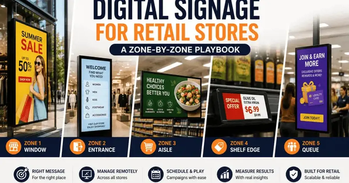
Retail signage fails when every screen plays the same loop. This playbook assigns a job to each zone of the store — window, entrance, aisle, shelf edge, queue — and shows what content each one needs.
On this page
Walk into most stores with digital signage and you will see the same loop on every screen: the window, the entrance, the aisle end, the till. Same content, same rotation, different location. It is the cheapest thing to do and it is why so much retail signage produces nothing measurable.
A customer standing in the window has a completely different question from one standing at the till, and a single rotating playlist answers neither well. This playbook assigns a distinct job to each zone of the store, sets out what content each one needs, and covers the campaign workflow and measurement that make a multi-store estate manageable.
The one-loop problem
The reason one loop everywhere feels sensible is that it is one content job instead of five. The reason it fails is that a message only works if it answers a question the viewer already has.
In the window, the viewer's question is is there anything for me in here? — answered in about three seconds, from several metres away, at an angle, in daylight. In the aisle it is where is the thing I came for, and which one should I pick? At the till it is am I done? — the only moment when "would you also like…" is a reasonable thing to say.
A single loop shows each of those messages in each of those places, so roughly one time in five the content matches the question. The rest of the time it is noise, and the cost of noise is not neutral: people learn to ignore the screens, and once that habit forms it applies to every screen including the ones with something useful on them.
The core idea: group screens by role across stores, not by store. The window group in all fifty stores gets window content. The queue group in all fifty gets queue content. You publish once per zone, not once per screen — and the content is right everywhere.
Five retail zones, five different jobs
Zone 1: The window
The hardest environment a display will ever face, and the one most often specified wrong.
The brightness question, first. A consumer TV runs 250–400 nits. Behind glass, in daylight, that is a dark grey rectangle. Window-rated commercial displays start around 2,500 nits and go beyond 4,000 for direct sun. This is the single most expensive mistake in retail signage because the only remedy is a new panel — you cannot fix it in software, and no amount of content work compensates.
Content rules for a window:
- One message. Not three. A passer-by gives you a glance, not a read.
- Readable in three seconds at five metres. If it takes longer, it is not a window asset.
- Motion earns the glance; stillness earns the read. A short movement to catch the eye, then something still long enough to be absorbed. Constant motion means nothing is ever read.
- Design for angles. People approach a window from the side, not head-on. Check legibility from 45 degrees before you sign off a design.
- Portrait often beats landscape, because it matches the proportions of a window bay and of a standing human being.
Windows are also the one zone that works after hours. A window running until 10pm advertises to everybody walking home, which is free reach that printed graphics in a dark shop do not get.
Zone 2: The entrance and decompression area
Retail research has described the first few metres inside a door as a decompression zone for decades: shoppers are adjusting to the light, the temperature and the layout, and they take in very little. Merchandise placed there underperforms, and so does signage.
So do not sell here. Orient instead. The entrance screen's job is to tell people where things are and what is happening today — the store directory, the floor guide, the one headline offer, opening hours and click-and-collect information. Save the selling for where people have slowed down.
The exception is a large-format screen positioned deeper into the sightline from the door. That is not really an entrance screen — it is a destination screen that happens to be visible from the entrance, and it can carry a proper campaign message.
Zone 3: Aisle and category signage
Here the shopper has slowed down and is comparing. This is where signage does its most useful work and where it is most often absent, because aisle screens are harder to install than a screen by the door.
What works in an aisle:
- Category navigation. What is in this aisle, in large type, readable down its length.
- Comparison content. Three options with their differences stated. This is genuinely helpful and it is the thing print struggles with, because it changes whenever the range changes.
- Provenance and specification. Where it came from, what it is made of, how to use it. Buyers in considered categories want this and asking a staff member is friction.
- Cross-sell within the category. The accessory, the refill, the thing people forget.
What does not: brand advertising the shopper has already responded to by standing in the aisle, and generic promotional loops that have nothing to do with the shelf they are next to.
Zone 4: Shelf edge
Small screens or e-paper strips at the shelf edge, replacing printed shelf-edge labels. A different economics conversation from the rest of the store.
The case is operational rather than promotional: price changes propagate instantly and correctly, which removes a genuinely expensive and error-prone manual task, and price accuracy at the shelf is a compliance matter in many jurisdictions. The promotional value — highlighting an offer at the exact point of selection — is real but secondary.
The case against is density. A hundred shelf-edge devices per aisle is a different order of deployment from six screens per store, in cost, in power and in device management. Most retailers who do this start with high-value or high-churn categories and expand only where the maths works.
Zone 5: The queue and till
The queue is the only place in the store where you have a customer's undivided attention and they cannot leave. It is also the last opportunity to change the basket.
What belongs here:
- Impulse items that are physically within reach. Advertising something two aisles away at the till is asking someone to leave the queue. They will not.
- Loyalty sign-up. The only moment the customer has both attention and a phone in hand.
- Services with a delayed benefit — delivery, returns policy, warranty, click-and-collect. These need explanation, and the queue is the only place there is time.
- Perceived wait reduction. Content that is genuinely interesting makes a queue feel shorter, which is a measurable satisfaction effect independent of anything you sell.
What does not belong: anything that requires the customer to go and get something, and anything with audio.
A content model that scales past ten stores
At three stores you can manage screens individually. At thirty you cannot, and the structure you set up early determines whether thirty is manageable or a full-time job.
The model that works has three layers:
Layer 1 — brand templates. Layouts, typography, colour, safe areas. Built once centrally, applied everywhere, not editable locally. This is what stops fifty stores producing fifty different-looking screens.
Layer 2 — role groups. Every screen belongs to a role group that spans all stores: window, entrance, aisle, queue. Campaigns publish to a role group and land in the right place in every store simultaneously.
Layer 3 — location groups. Every screen also belongs to its store, and its store belongs to a region. This handles trading hours, regional pricing, local events and anything genuinely location-specific.
Because a screen belongs to both a role group and a location group, a national campaign and a regional promotion coexist without anyone maintaining a spreadsheet of exceptions. This is the structural thing to get right on day one, because retrofitting it across an established estate is painful.
Running a campaign across every store at once
Retail promotions are time-boxed and stock-dependent, which makes scheduling and unpublishing more important than in most sectors.
Schedule the end, not just the start. A campaign that runs three days past its stock is worse than no campaign, because it advertises something you cannot sell and staff spend the time apologising. Set the end date at the same moment you set the start.
Build in a kill switch. When stock runs out early, one person should be able to unpublish across the estate in seconds. If that requires a request to an agency, it will not happen the same day.
Stage the content ahead of time. Scheduled to activate, not published on the morning. The failure mode of publishing at 8am on launch day is that one store's player is offline and nobody notices until a regional manager walks in.
Verify with proof-of-play. After launch, confirm the campaign actually appeared everywhere. Scheduled and played are not the same thing, and the difference is exactly where campaign post-mortems go wrong.
Letting stores override locally — safely
Two failure modes, equally damaging. Lock everything down and stores stop engaging: the screens become head office's problem, nobody reports a fault, and a blank display stays blank for a fortnight. Open everything up and the estate is off-brand inside a month.
The middle path is structural rather than procedural:
- Scoped editor roles. A store manager can edit their own store's screens and no others.
- A designated local zone. One region of the layout — usually a promotional slot — that local staff can populate from an approved asset library. The template around it is locked.
- Central override priority. A national campaign takes precedence over local content for its scheduled window, automatically.
- An audit trail. Who changed what, when. This is what makes delegation safe enough to actually grant.
Hardware choices per zone
| Zone | Display | Player | Watch out for |
|---|---|---|---|
| Window | High-brightness commercial, 2,500+ nits, often portrait | SoC panel or Windows for video walls | Under-specified brightness; heat build-up behind glass |
| Entrance | Commercial, 350–500 nits | Android TV or SoC | Mounting height and sightlines from the door |
| Aisle | Commercial, landscape or portrait | Android TV | Cable routing; physical protection from trolleys |
| Shelf edge | Small LCD or e-paper | Purpose-built | Device count, power and battery management at scale |
| Queue / till | Commercial, any size | Android TV or Fire TV | Viewing angle from the actual queue line |
For most zones an Android TV box is the sensible player. Windows earn Tizen or webOS SoC panels because you are buying commercial displays for the brightness anyway, and one device per screen matters in a location that is awkward to reach.
Who actually makes the content
The question that decides whether a retail signage estate is alive in year two, and the one most commonly left unanswered at procurement.
Three models exist and they fail differently.
In-house marketing. The team that makes your other creative also makes screen content. Best for brand consistency; the risk is that screens sit at the bottom of a queue behind print, email and social, and get whatever attention is left over. Works when screen content is a named line in someone's objectives rather than an afterthought.
Agency. External creative on a retainer. Produces good-looking work and removes the internal bottleneck. The problem is latency: a stock-out on Tuesday that needs the promo pulled by Wednesday does not fit a retainer workflow. If you use an agency, keep the ability to unpublish in-house.
Template plus contributors. Central marketing builds locked templates; store or category teams populate defined slots from an approved asset library. Highest throughput, lowest cost per item, and the only model that scales past about thirty stores without adding headcount. It requires the permission structure described above to be genuinely safe.
Whichever you choose, put a recurring calendar entry against the promotional zone before you buy a single screen. Deployments do not die from hardware failure — they die because content stopped and nobody noticed.
Accessibility and legibility standards
Retail screens are public information displays, and in several jurisdictions that brings obligations. Even where it does not, the same rules simply make screens work better for everyone.
- Contrast. Aim for at least 4.5:1 between text and background, and 7:1 for anything read at distance — the levels defined in the WCAG guidelines. Brand colours frequently fail this; check before you standardise a template, not after.
- Text size by distance. A minimum of one inch of cap height per ten feet of viewing distance, and roughly 1.5× that for comfort. Measure the actual viewing distance rather than estimating from a floor plan.
- Never rely on colour alone. A red price and a green price look identical to a meaningful share of your customers. Add a word or a symbol.
- Avoid rapid flashing. Content flashing more than three times a second is a genuine seizure risk and is prohibited under WCAG. This rules out some stock motion templates.
- Give people time to read. A slide that changes before an average reader has finished is not communication. Time your own reading and add 50%.
- Height and angle. A screen mounted where a wheelchair user cannot see it is not accessible regardless of how the content is designed.
Measuring retail signage without guessing
Most reported results compare revenue before and after installation, which measures the season, the weather and every other thing that changed at the same time.
A method that produces a number worth quoting:
- Choose a metric the screen can plausibly move. Units of the promoted category, or attachment rate for a specific add-on. Not total store revenue.
- Use matched store pairs. Similar footfall, format and demographic. Run the change in half, leave the other half unchanged.
- Compare the change in each group over the same period. Seasonality and national marketing hit both groups; the difference between the differences is yours.
- Change one variable. One. Three changes at once produce a result you cannot attribute.
- Verify what actually played. Proof-of-play logs before you interpret anything. A test store whose window player was offline for four days invalidates the whole comparison, silently.
- Run it for at least four weeks. Two weeks is dominated by day-of-week noise.
With screen groups, running two content variants across two sets of stores is a scheduling task rather than a project — which is what makes proper testing realistic rather than aspirational.
Where to start
If you have screens already, do not buy anything. Walk one store, write down what each screen is currently showing and what the customer standing in front of it actually needs, and fix the mismatches. That exercise usually finds two or three screens whose content is simply in the wrong place, and correcting it costs nothing.
If you are starting from scratch, start with the window — it has the largest audience and the clearest job — and get the brightness specification right, because that is the one decision you cannot revise later.
Built for multi-store estates. Qmanja Signage for retail gives you screen groups by role and by location, scheduled campaign windows with automatic expiry, synced window video walls up to 6 × 6, and proof-of-play so you can verify what ran. Your first screen is free.


